Brief 3 – Portraits (Submission)

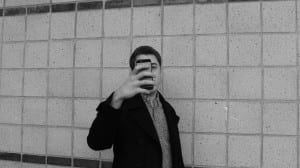
For my portrait brief I wanted to play with the theme of ‘selfie culture’. so with this in mind I set of to research selfie culture and try and find artists who are exploring it. At this point I found Richard Prince, Prince finds selfies via Instagram, then comments on them, and the transports them on to a canvas. I found this idea really interesting as selfie represents vanity in some regards, this is shown in a lot of Prince’s subjects who upload very staged and unnatural photos. by using this technique Prince is almost exposing this vanity.

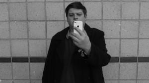
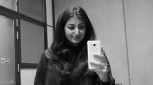
I wanted to replicate this to a degree, but one key difference in my work is that I wanted to take it in the other direction. so I set about taking an image of my self taking a photo and trying to represent my self naturally. I did them as if I was taking a photo for an ID. I then set about doing this with a friend and stranger, these were my results.

IMG_2939

IMG_2945

IMG_2936

When critiquing these photos I would say that the do give of a certain natural look, however not to the extent I hoped for. this brings up the question. I was very happy with my stranger photo because it looked natural and beautiful. In future I Would of used a 50mm lens in order to blur the background more and therefore emphasise the subjects more
Richard Prince’s Website http://www.richardprince.com/photographs/
Brief 2 – Found Objects (Submission)

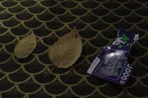
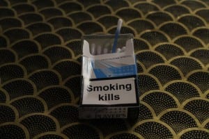
for this brief I wanted to get across a heavy feeling of binary opposites and did this by combining two found objects that somewhat contradict each other. this can be shown by the cigarette packet, which is representative of illness, against the cotton buds which represent cleanliness. the main inspiration for this brief was photographer by the name of Richard Wentworth as I found his work very interesting due to there simple but thought provoking nature. however for my photos I wanted to replicate the feeling, not style, of Wentworth’s photos. this can shown by the way =I staged my photos and becasue I feel the carry a heavier theme of cynicism, therefore more negative than wentworth’s work. so Wentworth was not a direct influence for me in this brief.

I was quite happy with my photos. however, one major problem for them would have to be the lighting as the photos are to dark and therefore they don’t stand out against my background as well as I wanted. this leads to a another point in where I thought my project succeeded in the form of the backdrop. this was because it was simple, but added more texture to my photos. I was fairly pleased with how my triptych was laid out but as there is progression of size from left to right but, given the opportunity in the future, i would like to spend more time on improving the horizon line of the triptych. this is because horizon lines really have the ability to draw audiences in.

An article on Richard Wentworth http://www.telegraph.co.uk/culture/art/art-features/11401173/Richard-Wentworth-interview.html

tryptich

Brief 1 – Appropriation (Submission)

for this brief I wanted to convey a sense of cynicism. this was inspired by a photographer who I found during my research by the name of Daniel Greer. Greer takes pre-existing images and the puts a heavy tone of cynicism on them. this is what I wanted to replicate using pawn shops of offer high interest loans and an image of the sign outside a gambling shop. these two adverts was a good and easy target for me to sue as i can try and bring out the almost evil nature of them. I did this by adjusting the shadows and adding an ominous tone of red, which is somewhat symbolic of evil.

Untitled-1

Photoshop experiment 1

Daniel Greer’s website. http://www.danielgreer.photography/

Brief 4 – Home (submssion)

for this brief I decided that I wanted to go for a theme of construction. This is because my home town, Bury St. Edmunds underwent a very quick transformation that really modernised my home town and I fell this is rings true within Lincoln.

for my research I looked into photographer who mapped city’s and how they changed. I found one Photographer who was particularly interesting called Sohei Nishino. Nishino took around 10,000 photos of London in order to edit down and make into a literal map. this i found interesting because it captures the soul of the city and presents it in a clear and thought provoking way. however Nishino was only my thematic inspiration, my physical inspiration comes from a photographer by the name of Edward Burtynsky

Burtynsky tasked himself with capturing the processes of industry, I liked this also mechanical approach of photography and wanted to implement it using a similar theme, the theme of construction.

1

6

5

3

2

IMG_2863

Edward Burtynsky’s website http://www.edwardburtynsky.com/